
MARILOU
TE POEL

About me
I’m Marilou te Poel, a multidisciplinary designer with a passion for design and problem-solving. With a bachelor's degree in Communication & Multimedia Design from Avans University of Applied Sciences and a diploma in Graphic Design from Grafisch Lyceum Utrecht, I combine creativity with strategic thinking to create meaningful visual concepts. I specialize in conceptualizing and translating ideas into engaging visual experiences, both online and offline, with a strong focus on storytelling, user experience, and the target audience.
By combining research, design methodologies, current design trends, and visual communication, I create work that is both visually compelling and purposeful. I approach every project with an open mind, exploring different perspectives to develop thoughtful and effective design solutions.
When I'm not designing, you'll probably find me exploring nature, enjoying a good cup of coffee, or catching up with friends and family over great food. Music is a big part of my life, and I love discovering new artists and genres, from house and breakbeat to rock, indie rock, pop, and R&B. At home, you'll often find me singing along to my favorite songs. I also enjoy spending time on the water, watching documentaries, and finding inspiration in the little things around me.
Work

Made at Smaac Strategy & Branding Agency together with Coen Bergmans.
Smaac foundation Branding


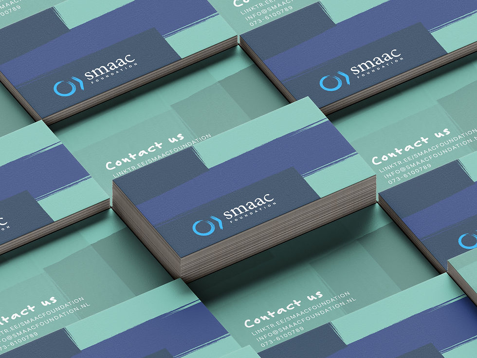
I created this project during my internship at Smaac in 2022–2023. Together with Coen Bergmans, I developed this brand identity for the Foundation of Smaac, an organization that educates children in underprivileged countries. We explored several stylescapes and creative directions, ultimately moving forward with the concept represented by the stylescape shown in the top right.
The blocks in the visual identity symbolize the building blocks in the lives of these children. The logo depicts a person reading a book, and paint was incorporated into the design because it is often one of the first things children learn to use at school. In addition, consideration was given to Smaac’s existing color palette, as well as its iconic blue circle, which is subtly reflected throughout the identity.

Final logo design for Koekolleke.
Freelance work

Cover art for Nils Heyden's Free Your Mind (UKG remix).

Betuws Vakwerk logo design.

Corporate Envelope Design for Huisartsenpraktijk Rosmalen Centrum.
koekolleke design Process


The client chose to retain the logo in black and white, resulting in a clean and timeless visual identity.
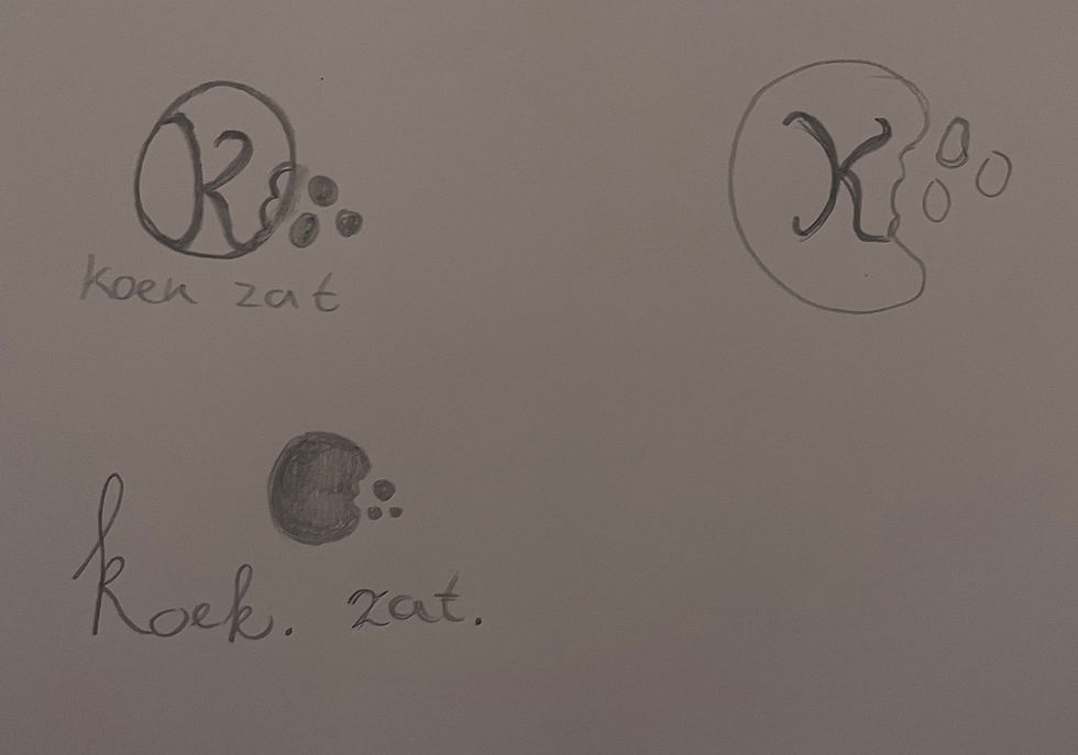
Following the sketch phase, the client decided to change the name from Koekzat to Koekolleke.


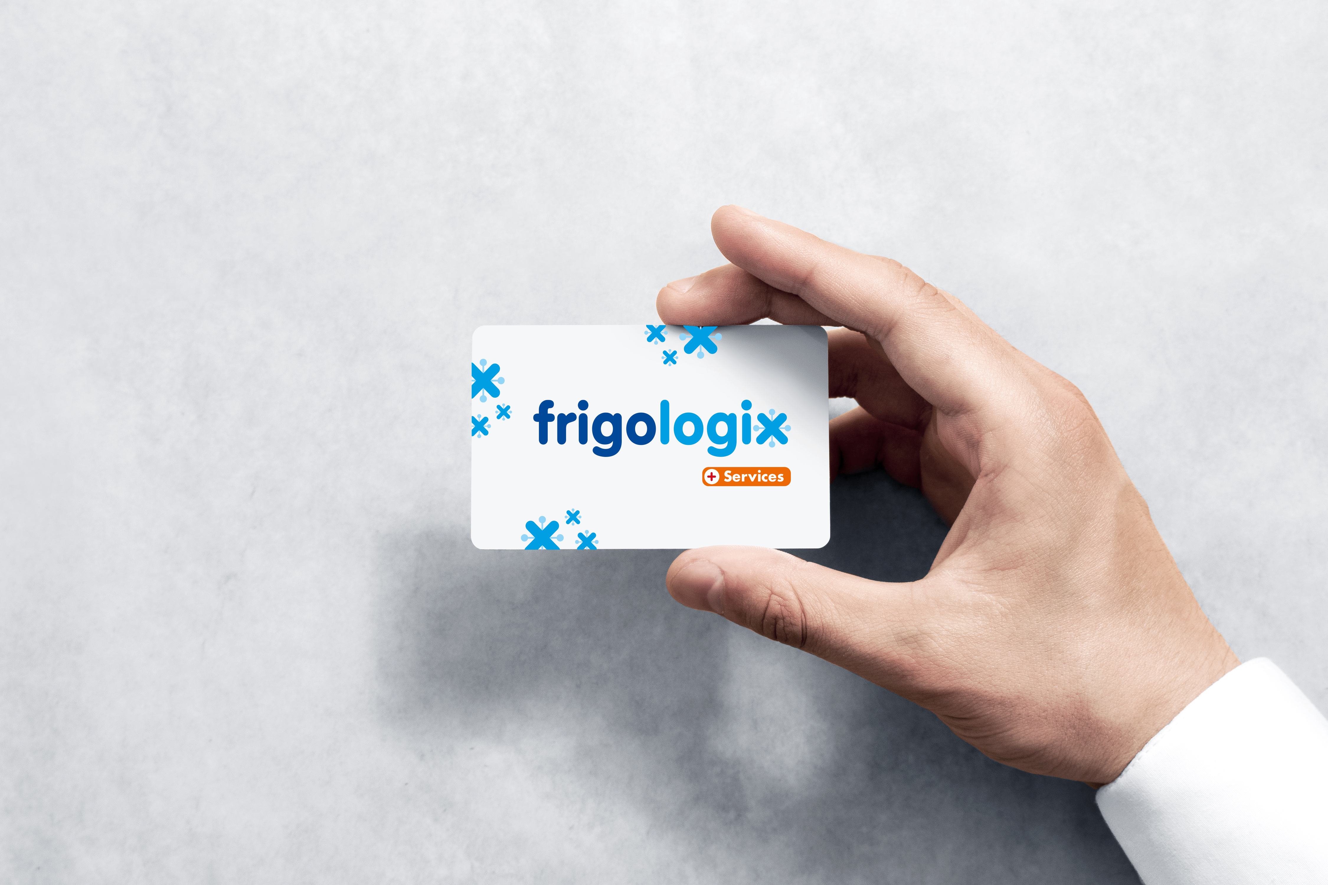
Refrigerator Wrap for Vindicat.
Internship work 2017 - 2018





Made at Advertising agency Aliens during my one year internship and working there in the summer.
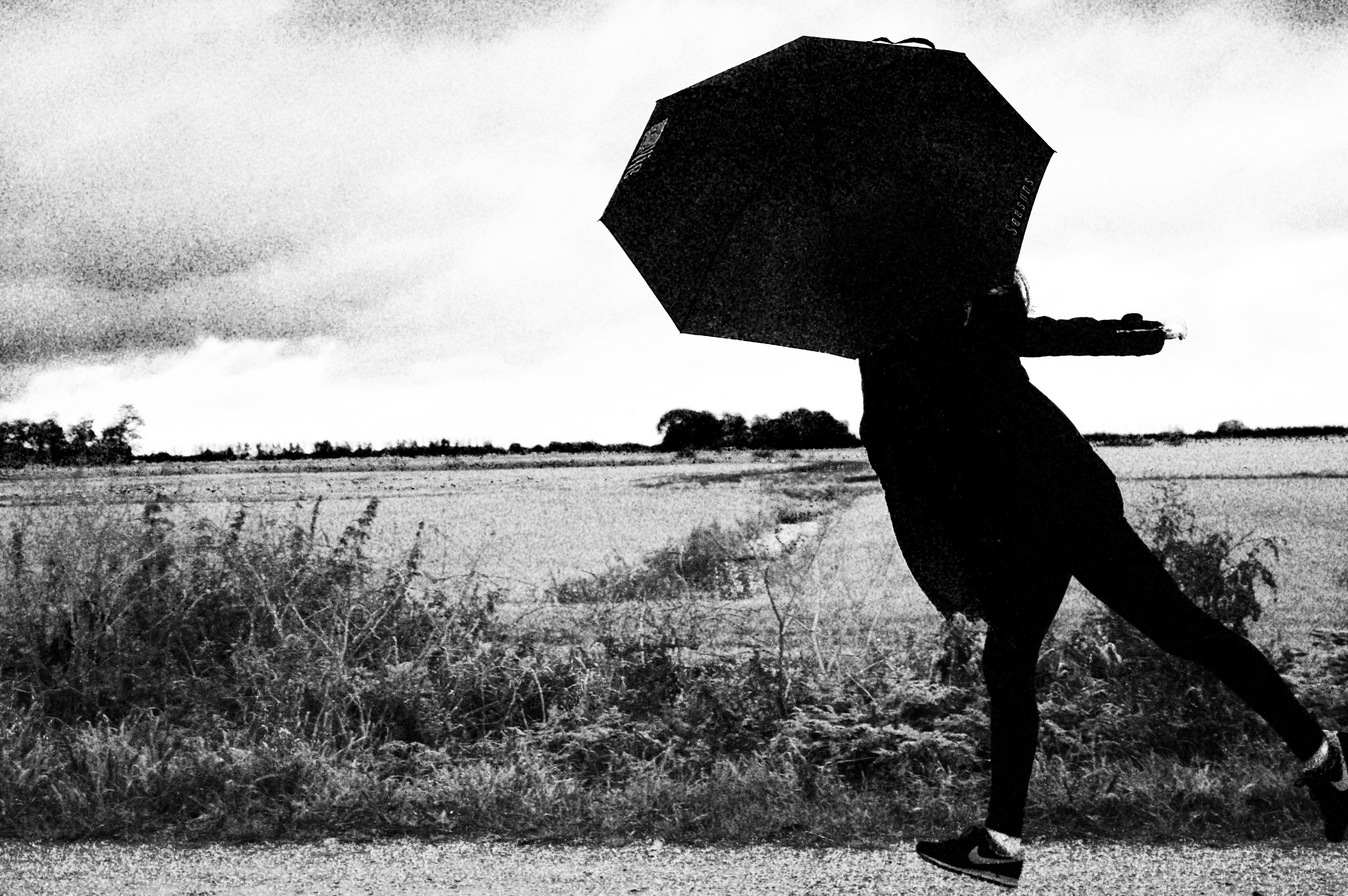
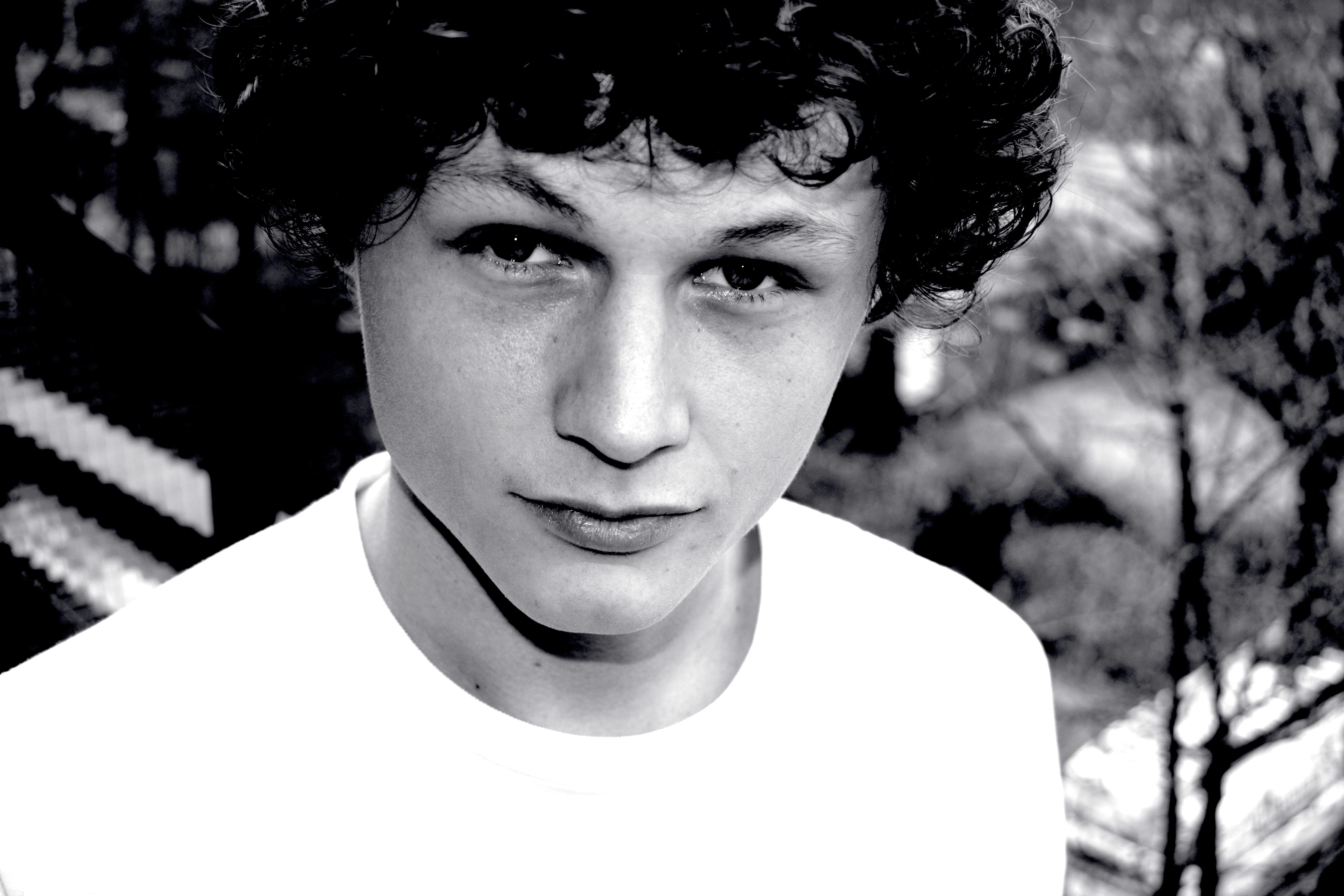
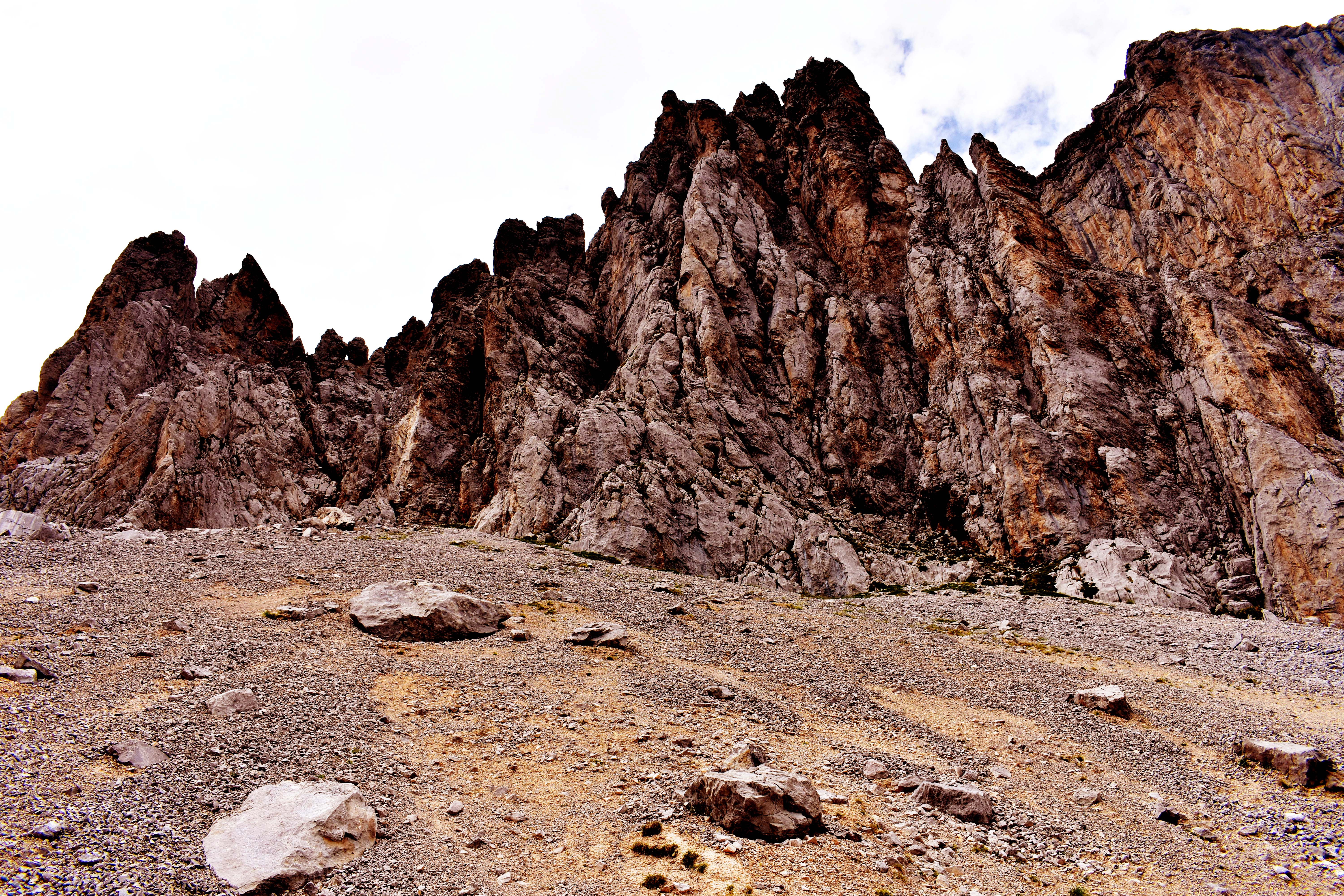
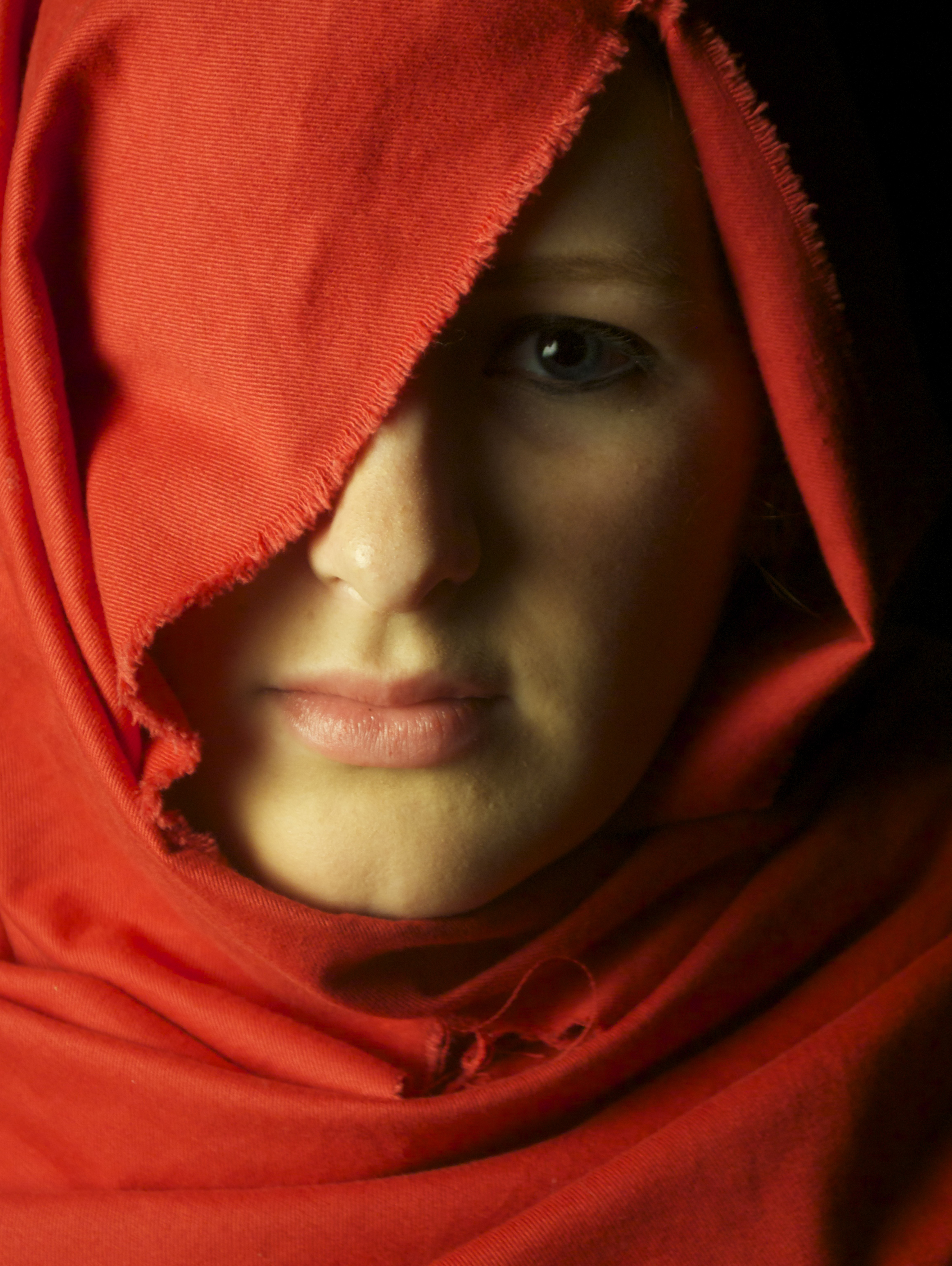
Photography





Let's make - TedX


This project was created during my Communication and Multimedia Design studies as part of a university assignment. The brief was to develop a concept, branding, and promotional materials for a TEDx event based on the theme “Let’s Make”.
My concept transformed TEDx into a networking event where professionals from different fields could exchange knowledge, connect, and learn from one another through speed networking sessions and masterclasses. For example, an accountant could help a designer, while a designer could support an entrepreneur.
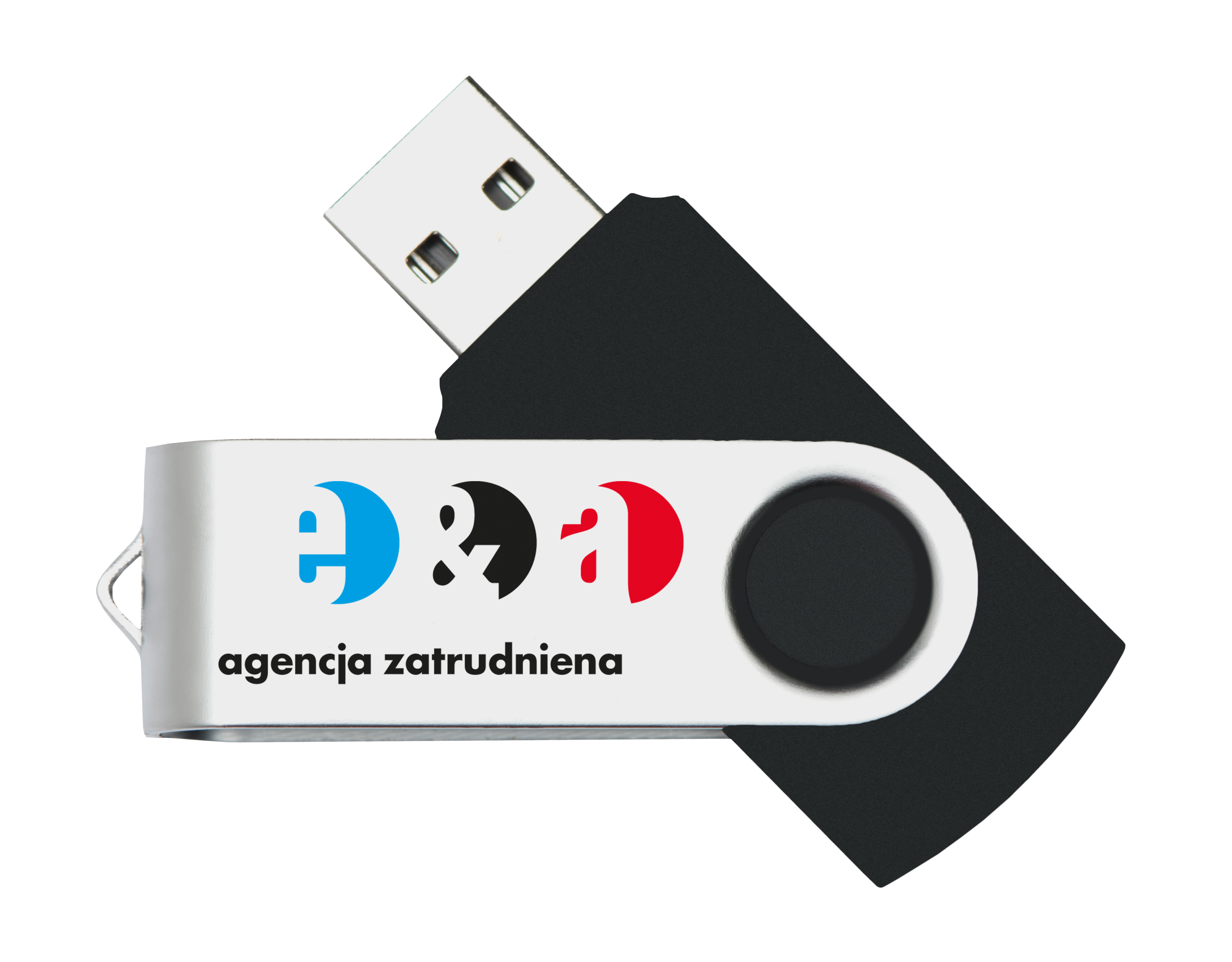
The visual identity uses a range of colors to represent different professional sectors, from finance and business to creative industries. The project included a variety of promotional campaign materials to attract attendees, as well as branded giveaways designed to serve as lasting reminders of the event.


Earth brew


Earth Brew is a self-initiated concept and branding project for a sustainable coffee brand, created for young people aged 18–40 who value sustainability, quality, and style. Inspired by the growing trend of Gen Z and millennials choosing coffee culture over traditional nightlife, Earth Brew combines specialty coffee with House and Techno culture to create a unique community space in Amsterdam where people can meet, work, relax, and discover music in a more meaningful way.
Visitors can enjoy sustainably sourced specialty coffee, purchase coffee beans for home brewing, and experience live performances by local House and Techno DJs. The concept also includes a vinyl library, offering members the opportunity to borrow records instead of purchasing them. For €19.99 per month, members receive five complimentary coffees and five vinyl borrowing credits, with up to six records per rental. By encouraging the sharing of music, Earth Brew promotes a more sustainable and accessible way of discovering and enjoying music culture.
The visual identity reflects the brand’s core values of sustainability, community, authenticity, and connection. The circular shapes in the logo represent both vinyl records and the social circles formed through coffee, music, and shared experiences. Earth Brew is designed to bring people together, creating an environment where conversations, creativity, and new connections can flourish.
At the heart of the logo is a leaf symbol that reflects the brand’s commitment to sustainability. Hidden within this symbol is a coffee bean, directly connecting the identity to Earth Brew’s coffee offering. The leaf is constructed from multiple elements that unite to form a single shape, symbolizing the community behind the brand. Just as individuals contribute to a larger collective, Earth Brew is shaped by the people who meet, share ideas, and inspire one another.
Together, the concept and visual identity communicate Earth Brew’s mission: connecting people through coffee, music, and community while encouraging a more conscious and sustainable lifestyle.
Han - sustainable solutions interactive onboarding experience
_inwerktraject_ENGtestscherpte.png)

The video alongside this page shows interns and consultants using the escape box and the board game. It also features snapshots of one of the game's activities, as well as interviews in which they share their opinions and experiences.
All products for the project are made using second-hand or sustainable materials. Even the paper is FSC-certified, and this is a one-of-a-kind piece.
Throughout this project, the emphasis was placed on developing a strong concept, engaging gameplay, and a meaningful user experience, while keeping sustainability at its core. The focus was on creating a thoughtful and well-founded design solution, with the visual design serving to support and communicate the concept rather than define the project itself.